

Visual AI templates fall short of design schools: steering models with art terminology safeguards posters from monotony


Listen to this article
Read by Anchor
Automatically generated promotional posters sparked a broad wave of dissatisfaction after identical visual styles dominated, a trend noted in social media discussions and covered by news reports such as The Independent, where followers criticized the severe repetition in public event ads like the 2026 Limington beer festival poster. The real problem with these designs is not their failure to meet basic technical standards, but that their usual appearance becomes a source of visual aversion for the viewer when it is repeated dozens of times on streets and online pages.
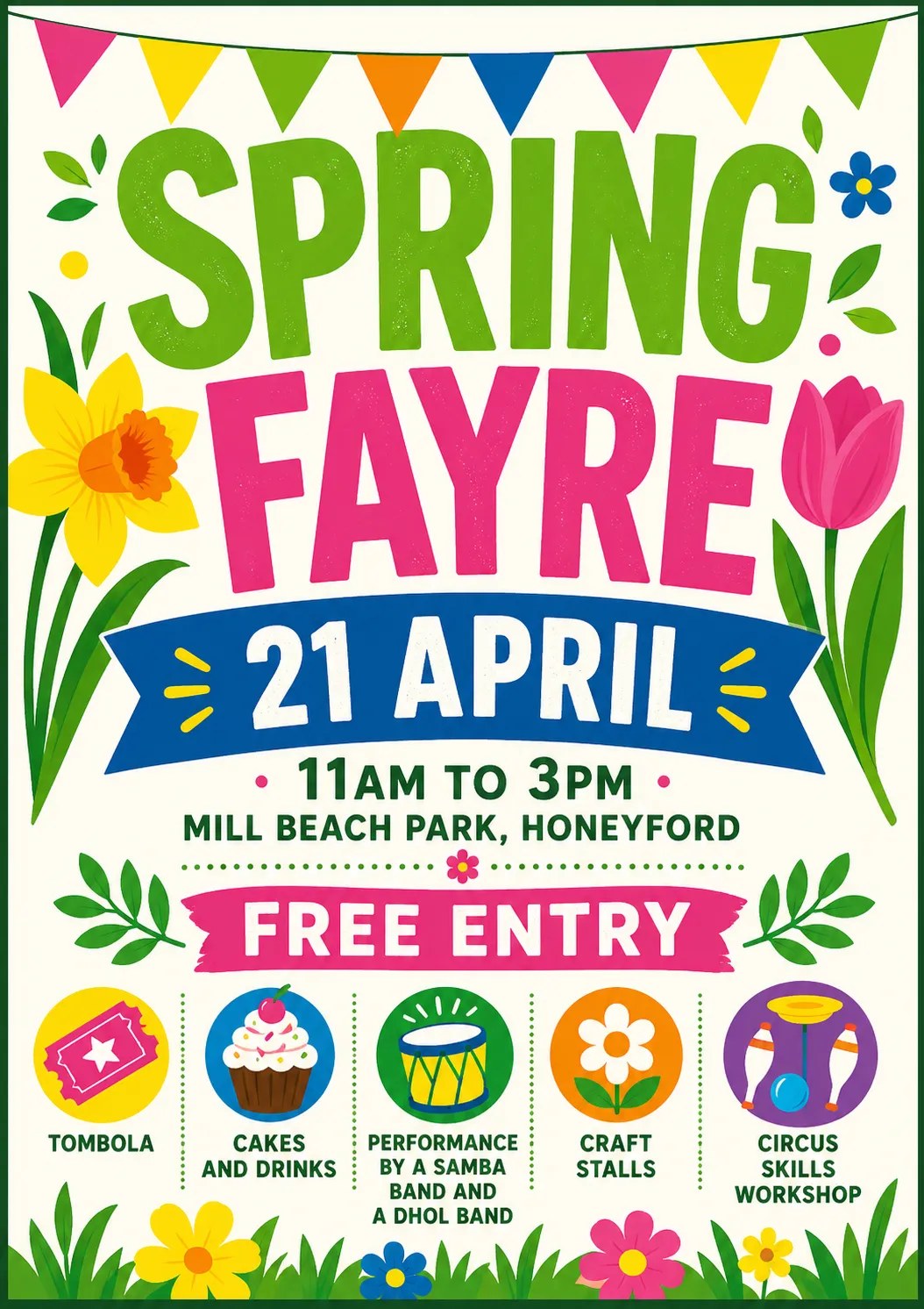
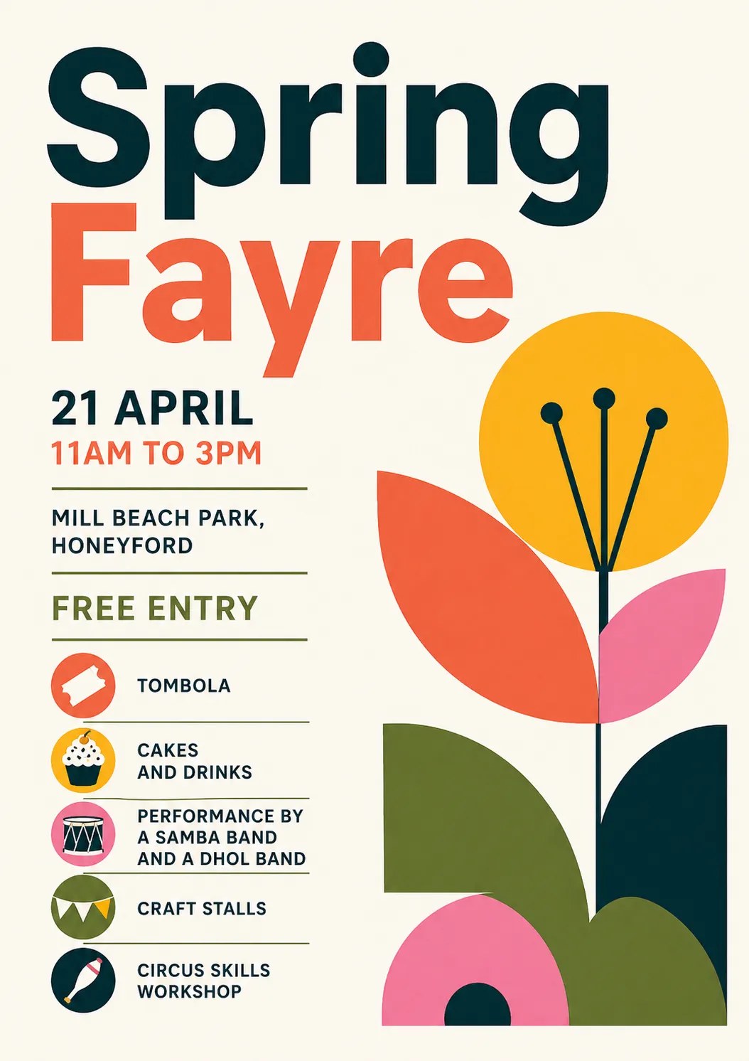
Escaping the trap of stereotypical repetition requires breaking automatic templates.This was demonstrated in a practical experiment documented by developer John Hartnob to test the capabilities of the ChatGPT model in generating a poster for a spring festival featuring musical performances and circus workshops. Although explicit instructions were given to avoid oil illustrations and watercolor pastel colors, the model in its first attempt reproduced the usual literal template that troubles the viewer. Differentiation was achieved only when it was forced to discard its previous design, treat it as an example of what to avoid, and steer it toward the aesthetics of the Bauhaus school and modern design movements that rely on simple geometric layouts, clear lines, and strong color contrast based on Swiss design principles.
First attempt
Second attempt
The first text prompt, as written by Hartnob
Event data followed by an explicit visual constraint, which alone was insufficient.
Produce a poster for a spring fayre.
21 April - 11am to 3pm
Mill Beach Park, Honeyford
Free entry
Tombola
Cakes and drinks
Performance by a samba band and a dhol band.
Craft stalls
Circus Skills workshop

Go for a clean, unfussy, bright layout with a bold striking spring-themed graphic. Avoid pastel/airbrush/oil style art or images of people.
The second prompt, which made the difference
The prompt does not name any artistic school; instead it asks the model to treat its previous output as an example of what to avoid.
Make another one using a completely different design aesthetic of your choice.
Treat the current one as a “what not to do” – not that there is anything
wrong with it, but we want ours to stand out from other posters that look
similar.
Posters and prompts from John Hartnob’s experiment published at john.hartnup.uk, displayed here for documentation.
This experiment revealed an expanded list of visual art schools that the model can accurately summon simply by naming them with their historical terms, including lithography, paper collage art inspired by Henri Matisse, brutalist architecture, Japanese minimalism, the Memphis movement of the post-modern era, as well as punk music posters and 1990s print styles. When I dissected these results, I observed a precise programming behavior where sub-texts generated automatically by the model infiltrated and persisted in the cumulative conversation context across subsequent model runs, requiring the context window to be cleared when testing different visual approaches. Switching to models such as Claude and Gemini also allows moving beyond static flat images to generate designs in open, editable formats like web pages and layered digital print files.
Four of the styles the model invoked, with their names
The data are identical across the four, the only variable is the requested visual school name. Each poster includes a fixed command beneath as written.
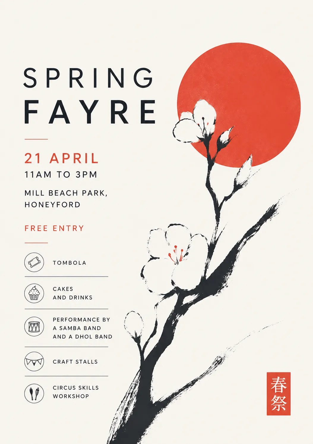
Japanese minimalism
and now please Japanese Minimal Poster
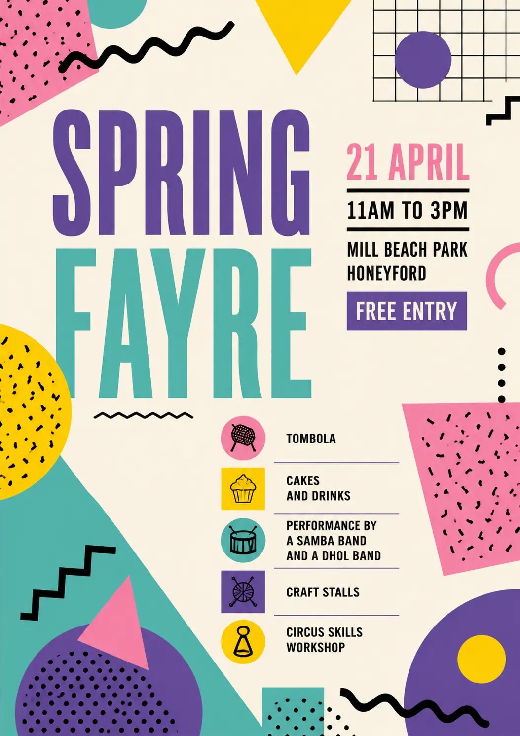
Memphis movement
Now do Memphis Design please
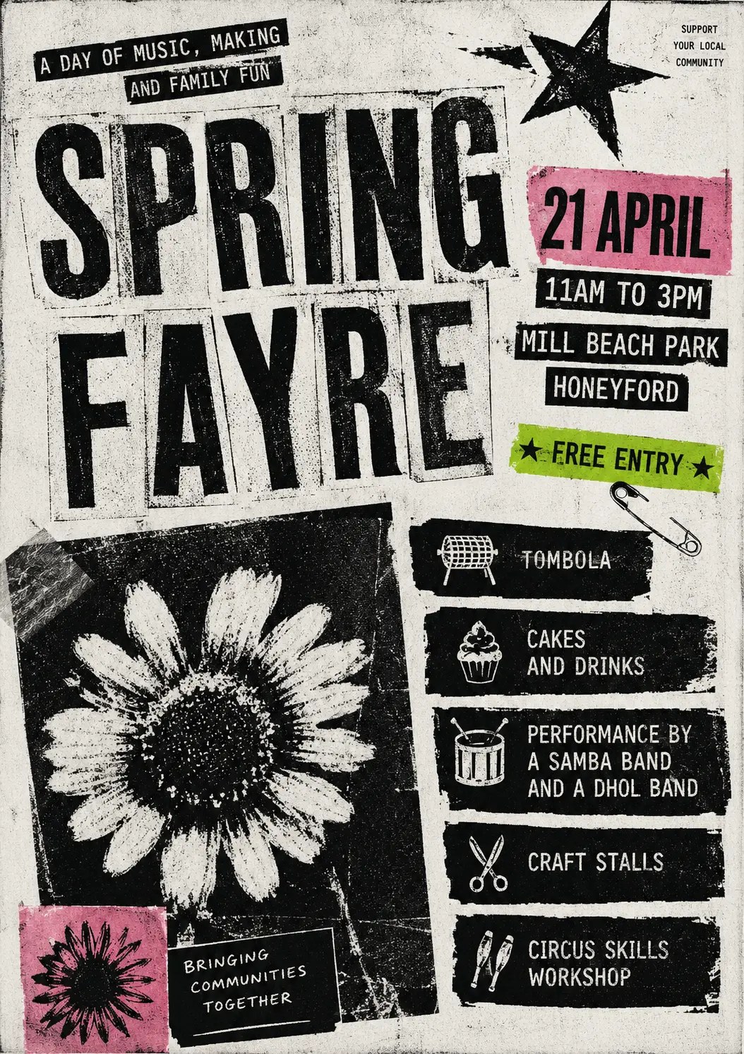
Illustrated punk prints
Now with the aesthetic of a photocopied 1980 punk fanzine. But with some colour snuck in.
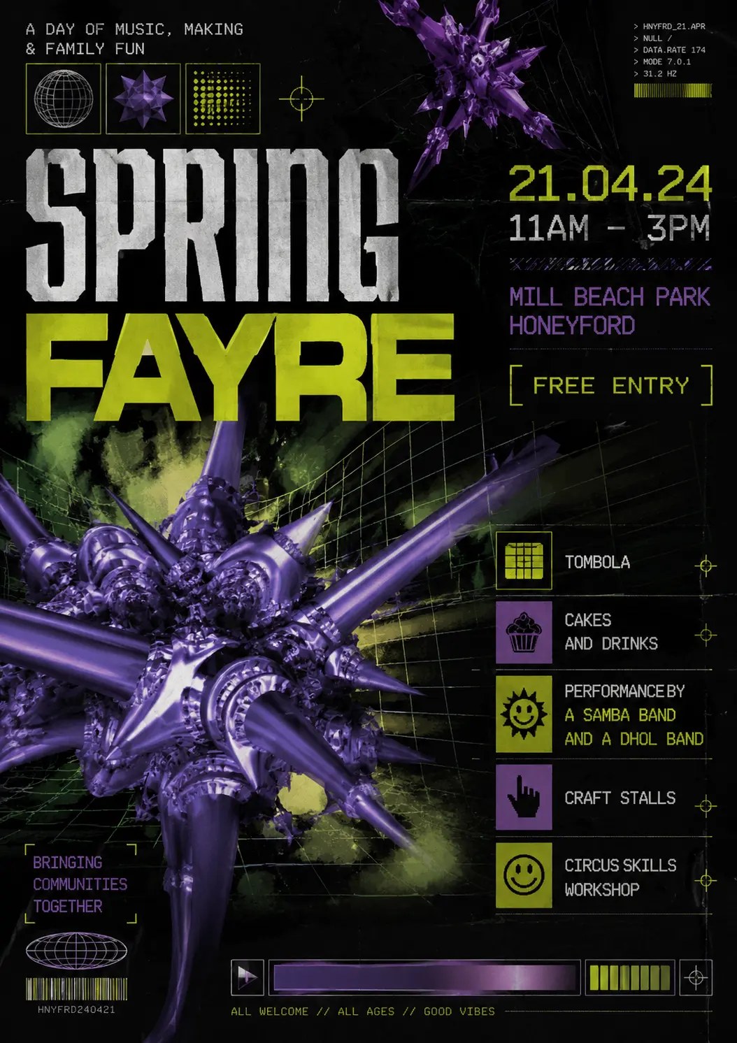
Nineties party poster
Now please make one in the style of a 90s drum n bass gig flyer, with early 3D/fractal computer imagery
In the last two posters a line appears that no one requested: “A DAY OF MUSIC, MAKING AND FAMILY FUN”. The model invented it in an earlier turn, it remained in the conversation context and carried over to subsequent outputs. Anyone seeking a specific style must request it from a clean context window.
Source: john.hartnup.uk
I see that this shift requires a decisive reset for design and marketing teams in the Gulf, Egypt, and the Levant, where fast-moving events and conferences face the risk of public aversion due to reliance on automatic generation interfaces that produce repeated visual identities. What changes in practice for the designer and executive is not abandoning AI tools, but elevating the skill of prompting by moving from random description to guiding models with the terminology of artistic schools and their geometric compositions. When building a campaign, be sure to invoke these visual specifications to lower the cost of wasted experiments and protect your brand, while moving toward editable digital formats that allow localization of text and flexible font adaptation, away from the rigidity of static images.